When I first started wearing color, I made the classic mistake of going all in at once.
Full color top.
Colorful skirt.
Bright bag.
And I looked, well… chaotic.
The trick I discovered — and I wish someone had told me sooner — is to anchor your look with one hero color and build neutrals around it.
So if you love a tomato red midi skirt, pair it with a soft ivory blouse and nude heels.
Let the color breathe.
Let it be the star.
You don’t need to add more color to make a statement.
Just one piece, worn intentionally, does all the work.
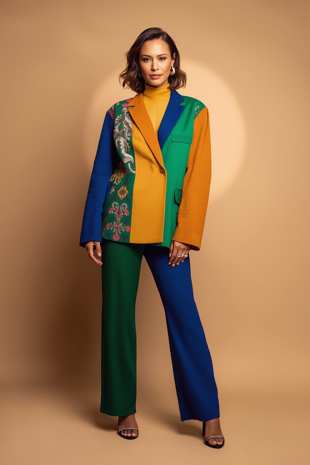
I remember the first time I wore a single emerald green blazer over simple white jeans and a white tee.
People stopped me on the street.
That one piece was enough.
So start there — one color, everything else quiet.
My Thoughts on Choosing Colors That Love Your Skin Tone

Okay, this is the part nobody talks about honestly enough, and it matters so much.
Not every color is going to love you back the same way.
And that’s not a sad thing — it’s actually really freeing once you understand it.
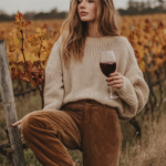
Warm skin tones (think golden, peachy, olive undertones) tend to glow in earthy colors — rust, mustard, warm camel, olive green, coral.
Cool skin tones (think pink, rosy, or bluish undertones) absolutely shine in jewel tones — sapphire blue, emerald, berry, plum, cool lavender.
And neutral skin tones?
You lucky thing — you can basically wear anything.
When I figured out I had warm undertones, I stopped forcing myself into cool pinks and started leaning into terracotta and warm camel shades.
The difference was honestly kind of emotional.
I looked alive in a way I hadn’t before.
So before you say “color doesn’t work for me,” try to figure out your undertone first.
It changes everything.
How I Use Neutrals to Balance a Bold Color Piece

This is my most-used styling hack, and I use it almost every single day.
Neutrals are not boring.
Neutrals are your best friend when you want to wear color without looking overdone.
Think of your neutrals — white, cream, beige, grey, tan, black — as the frame around a painting.
The painting (your color piece) gets to shine because the frame isn’t competing.
When I wear a bright cobalt blue top, I pair it with straight-leg light-wash jeans and simple white sneakers.
That’s it.
Clean.
Effortless.
So, so chic.
The blue pops without screaming.
If I want to feel a little more polished, I’ll swap the jeans for tailored beige trousers.
Same energy, slightly elevated.
The formula is simple: bold color + neutral bottom + neutral shoes.
Or: neutral top + color bottom + neutral shoes.
One color.
Two neutrals.
You cannot go wrong.
My Favorite Way to Ease Into Color — The Accessory Route

If jumping straight into a colorful outfit feels like too much, start with accessories.
This is genuinely how I built my confidence with color before I started wearing full color outfits.
A bright red bag with a neutral outfit is stunning.
A cobalt blue belt can completely transform a beige dress.
Colorful earrings against a white button-down feel fresh and fashion-forward without feeling like you’re in costume.
I remember buying a burnt orange leather bag when I was still very much a “black and white wardrobe” kind of person.
That bag was my gateway drug, honestly.
People complimented it constantly.
And it made me realize — color makes people happy.
It makes YOU happy too, when you wear it with just a little intention.
Accessories are low-commitment and high-reward.
Start there if you’re nervous.
Work your way up to the full look once your confidence builds.
The Color-on-Color Thing — When It Works and When It Doesn’t

Color-on-color dressing is having such a major moment, and I love it so much.
But there’s a right way and a slightly chaotic way to do it.
The right way?
Tone-on-tone.
That means wearing different shades of the same color family together.
Picture a dusty rose blouse with deep burgundy wide-leg trousers.
Or a soft sage green cardigan layered over a deeper forest green dress.
It’s rich.
It’s intentional.
It feels expensive.
The chaotic way — and I say this with love — is clashing bright colors with no visual anchor.
Hot pink and neon orange together, for example, needs a lot of confidence and a very specific styling vision to pull off.
Not impossible, but not beginner-friendly.
If I were starting color-on-color dressing right now, I’d begin with two shades of blue, or two shades of pink, or two shades of green.
Safe, cohesive, and genuinely gorgeous.
Why Fabric and Texture Change Everything About How Color Reads

Here is something that took me an embarrassingly long time to figure out.
The same color in a shiny satin fabric and a soft matte linen reads completely differently.
Satin amplifies color.
It makes it louder, bolder, more statement-making.
Linen or cotton softens color.
It makes it feel casual, earthy, approachable.
So if you’re nervous about a bold color, choose it in a matte, natural fabric first.
A rust-colored linen trousers is so much easier to style than a glossy rust satin skirt, even though the color is identical.
When I bought my first bright yellow piece — a soft cotton midi dress — I was shocked at how wearable it felt.
Nothing harsh.
Nothing overwhelming.
Just warm, sunny, beautiful.
Fabric is literally the volume dial for your color.
Turn it down with matte textures if you want something subtle.
Turn it up with satin or silk if you want to really make an entrance.
My Tips on Pattern Mixing With Color (Without Losing Your Mind)

Pattern mixing with color is honestly one of the most fun ways to dress, but it can feel super intimidating.
My personal rule?
If you’re mixing patterns, keep the color palette tight.
So instead of stripes in red AND florals in purple AND a plaid in green — try florals in blush pink with thin stripes in the same blush pink and cream family.
The patterns are different, but the colors are connected.
It reads curated, not chaotic.
I tried this last spring with a soft floral skirt and a thin vertical striped top, both in a dusty pink and white palette.
It looked so intentional that a friend actually asked if I’d styled it professionally.
I had not.
I’d just kept the colors cohesive while letting the patterns play.
That’s the secret, really.
Color harmony first.
Pattern variety second.
How I Style Color for Work Without Looking Unprofessional

Color at work is so underrated and I genuinely want to change your mind about it if you’ve been sticking to all-black everything at the office.
The key is choosing sophisticated, muted shades rather than super saturated ones.
Think dusty teal instead of neon turquoise.
Think oxblood instead of fire-engine red.
Think olive instead of lime green.
I wore a deep plum structured blazer to a meeting once and got so many compliments.
It was professional, polished, and completely memorable.
If you want to ease color into your work wardrobe, start with a colorful blazer over neutral separates.
Or a deep-toned silk blouse tucked into tailored grey trousers.
The structure of work clothes makes color look more elevated and less casual.
Color in a flowy bohemian dress reads differently than color in a sharp, well-fitted trouser suit.
Context matters — but color absolutely has a place at work.
The Emotional Reason Color Actually Matters in Your Wardrobe

Okay, I want to get a little personal for a second.
There is a reason we feel differently when we wear color.
It’s not just visual — it’s emotional.
Studies have looked into how color affects mood, but honestly, I didn’t need a study to know this.
I know how I feel when I slip on my favorite coral dress on a dull Tuesday.
Instantly lighter.
Instantly more me.
Color is a form of self-expression that requires zero words.
It tells the world something about your energy before you even open your mouth.
And I think a lot of women hold themselves back from color because they’ve been taught, quietly and over time, that being loud — even visually — is too much.
It is not too much.
You are not too much.
Wearing a color that makes you feel alive is one of the simplest, most accessible forms of joy available to you.
And you deserve that.
My Personal Color Combinations I Come Back to Again and Again

I have a few color combinations that I genuinely think are foolproof and I want to share them with you like the color-obsessed friend I am.
Camel + burgundy.
So rich.
So autumn.
So elegant.
Cobalt blue + white.
Fresh, crisp, and effortlessly chic.
Dusty rose + cognac.
Soft and warm and so feminine.
Forest green + cream.
Feels like a cozy cabin and a fashion magazine had a baby.
Rust + mustard.
Bold but cohesive.
Very vintage-inspired energy.
Soft lavender + grey.
Unexpected and sophisticated.
These are my go-to pairings when I want to wear color but don’t want to think too hard.
I’ve mixed and matched them for years and they have never let me down.
Try one this week and see how you feel.
I’m betting you’ll feel incredible.
What I Do When I’m Unsure About a Color Outfit Before Leaving the House

We all have that moment of doubt at the door.
You’re dressed, you look colorful, and suddenly you’re second-guessing everything.
Here’s what I actually do in that moment.
I step outside in the natural light.
Artificial lighting can make colors look harsher than they actually are.
Natural light tells the truth.
I also do a quick “squint test” — I squint at my reflection and see if one element feels visually overwhelming compared to the rest.
If it does, I swap it out.
Usually it’s a bag or a shoe that I can quickly change.
I also trust my gut.
If I put on a color combination and feel even slightly uncomfortable, that feeling will follow me all day.
But if I put it on and feel a little spark of something — excitement, happiness, that “ooh, yes” feeling — I keep it on and walk out the door.
That spark is always right.
Shopping for Color — My Advice on Building a Colorful Wardrobe Gradually

Building a colorful wardrobe doesn’t happen overnight and it shouldn’t.
I think of it like learning a new language — you start with a few key phrases and build vocabulary over time.
Start by identifying one or two colors you’re genuinely drawn to.
Not what’s trending.
Not what looks good on someone else.
What makes your heart do a little thing when you see it.
For me, it was always earthy warm tones — terracotta, warm rust, dusty camel.
So I started there.
I bought one good quality piece in each color — a sweater, a blouse, a pair of trousers.
Then I noticed how naturally those colors mixed with what I already owned.
I didn’t overhaul my whole wardrobe.
I just added color slowly, intentionally, and it started to feel cohesive.
Now my closet feels like me.
Colorful, warm, considered.
That’s the goal — not a rainbow explosion, but a wardrobe that feels personal and alive.
And honestly?
Once you start, you will never go back to all beige everything.
I promise you that.